28 Dec Bifurcated landing page

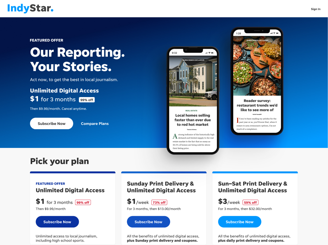
Desktop design featuring aspirational text in the “hero” position.
What do I mean by bifurcated? Simply put, we deliver different messaging to potential customers based on device size.
What we discovered early on during usertesting was that while desktop users responded more favorably to a detailed sales pitch, mobile customers did not.
What we learned is that the behaviors of desktop/mobile audiences are not identical.
 Instead, what worked best on mobile was a highly-targeted value pitch. Basically, they just wanted to know what each package was going to cost. So while we led the desktop page with “Our Reporting. Your Stories” title, on mobile, we instead went right to the “$1 for 6 months” pricepoint.
What we can learn from this is that mobile users are already more targeted, when it comes to the sales process. If they’re on that page, they’re already closer to committing to a purchase than the desktop customers are shown to be. Desktop customers are more likely to be looking/comparing prior to a decision, whereas mobile customers just want to follow through at that point.
So basically, if all you’re doing is creating a responsive version of your page, you could be negatively impacting your total sales.


Sorry, the comment form is closed at this time.