
Add-ons at Checkout
***
Overview
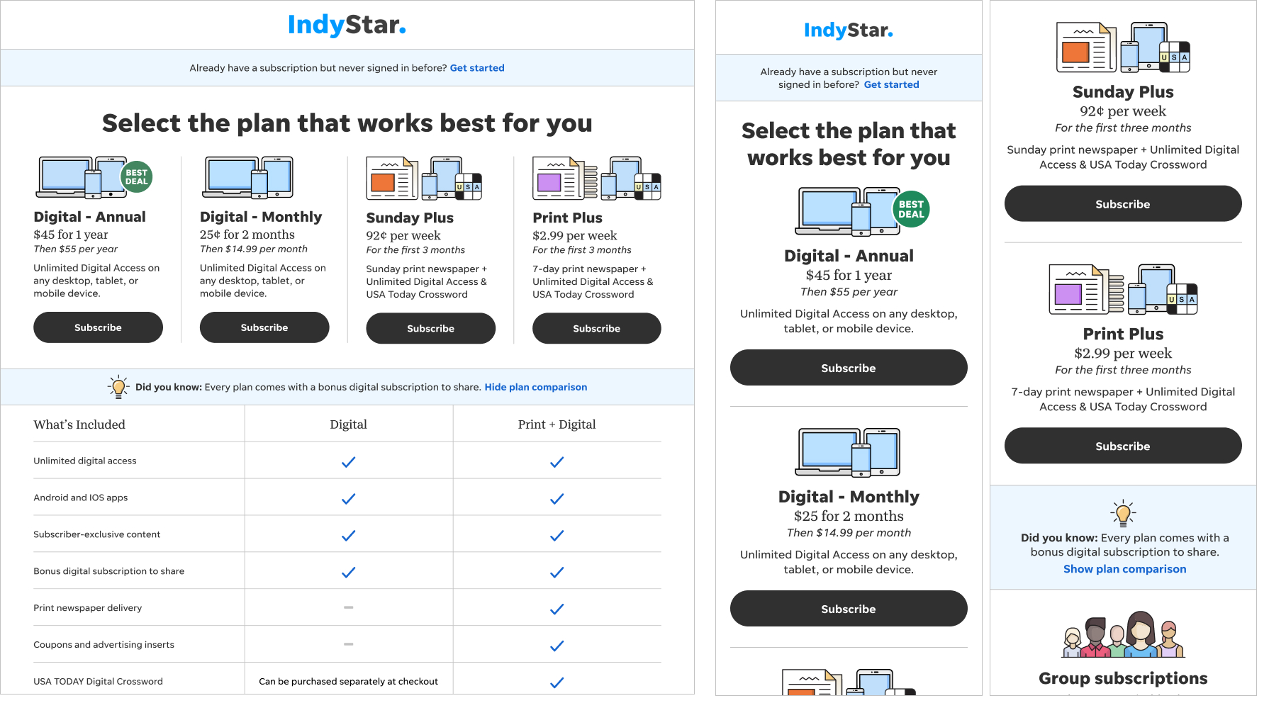
Increasing revenue-per-customer can be very challenging. While they might be interested in the features of a premium bundle, it can be difficult to get the customer to commit to the added price.
Objective
So with that in mind, we researched moving away from trying to create premium bundles of products to instead looking at more of an ala carte model. This allows the customer to evaluate each item on it’s own merit and decide exactly what they’re willing to commit to subscribing to. It’s really about getting something they’d be more comfortable paying for.
My role
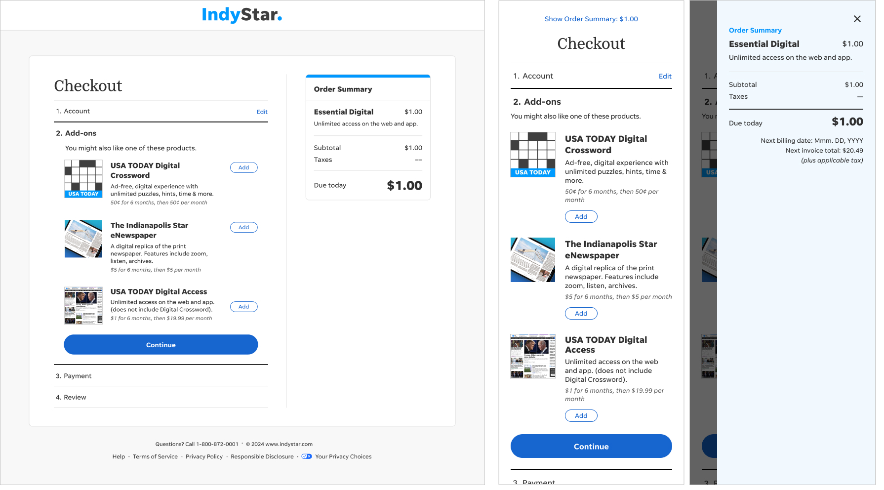
I performed a competitive analysis of roughly a dozen market-leading sites and compiled some best practice examples. For example, rather than surface the add-ons within the checkout flow, most retail sites place upsells in the cart, where a user encounters them the moment they’ve decided to purchase.
So with that in mind, I performed unmoderated tests on multiple prototypes, refining everything from the language to the iconography.
Our solution places the add-ons screen between account creation and payment. We labeled the steps in order help the customer understand where they were in the process and what they could expect next.
Outcome
The design tested extremely well. We conducted six rounds of unmoderated user tests—on both desktop and mobile—focusing on everything from iconography to verbiage.
100% of our test groups understood what the upsell products were, as well as what they would cost. No one in our tests was irritated to see the upsells, and Crossword was the most popular option.