


Wayfinding
***
Overview
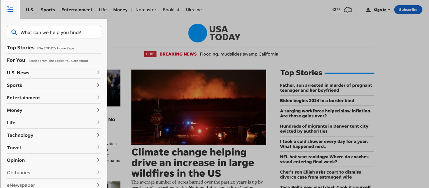
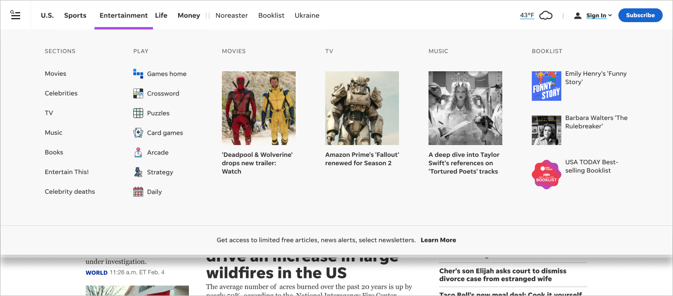
USA TODAY is a fairly deep site, but too often users don’t drill down very far to access content. We wanted to see what we could do to improve that by creating a navigation structure that better supports and showcases our content.
Objective
We took this as an opportunity to take a holistic approach to the navigation, and see what we could do to solve for numerous use cases.
We wanted to:
• Organize navigation in a more easily-scanned manner
• Incorporate a hamburger menu icon so that all platforms (desktop/tablet/mobile) have a common experience
• Promote newsletters
• Promote podcasts
• Break out sign-in status and subscribe to help customers realize whether or not they’re signed in
• Create a more elegant breaking news banner
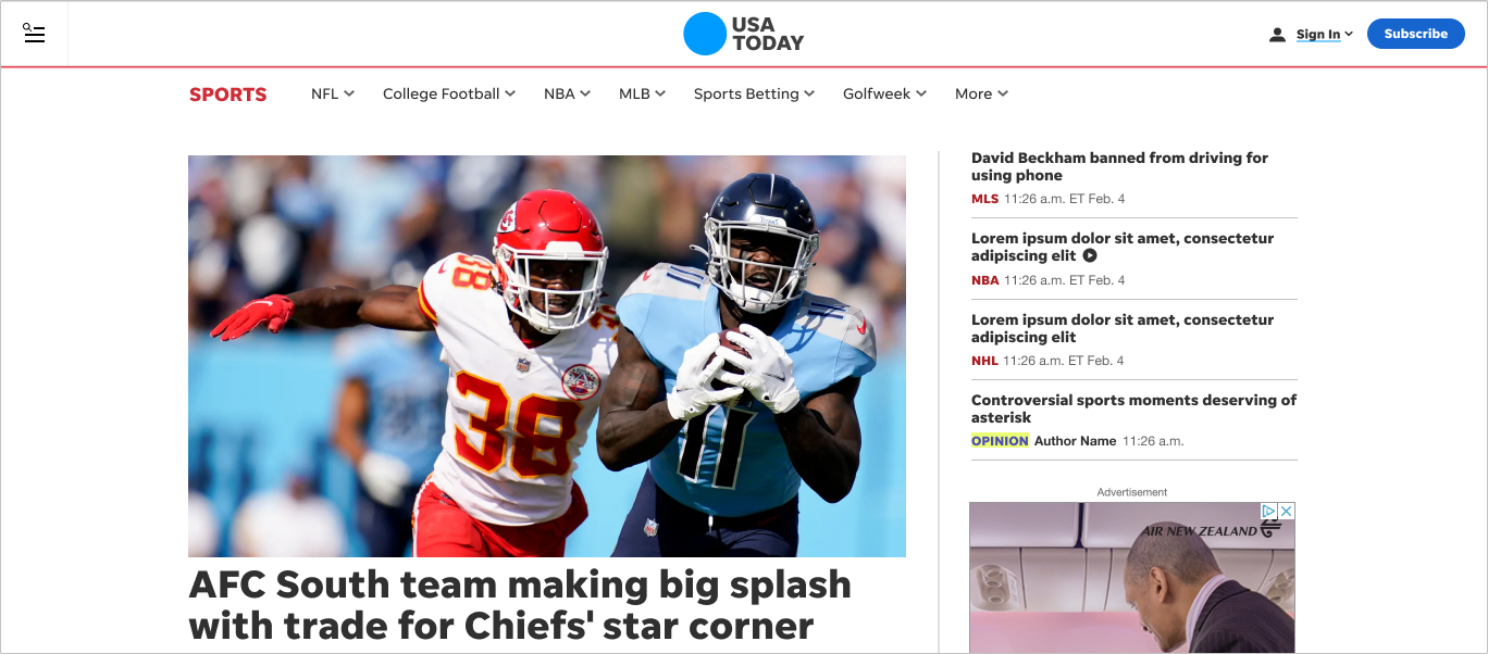
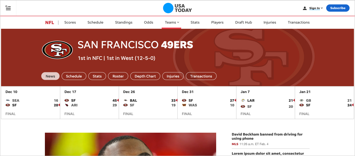
• Surface relevant links on directories and subdirectories
My role
I co-designed this project with one of my direct reports. I also provided guidance on how best to user test the designs.
Outcome
We performed several rounds of user tests and the results were positive.
• 100% of users understood that the top nav layer was for the most important sections.
• 100% of users understood that they could find everything—including the search—via the hamburger.
• 100% of users noticed the secondary and tertiary navigation.