The Wall
***
Overview
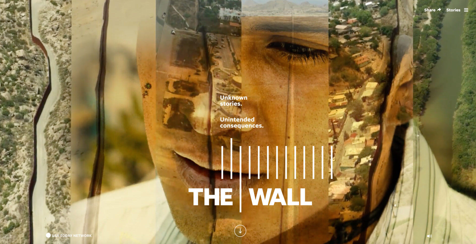
A few years ago, I helped design a Pulitzer-winning project for USA TODAY, The Wall.
Objective
This endevour utilized editors, reporters, multimedia creators and informatics experts from all-across Gannett, for a year-long investigative dive into the then-proposed wall on our southern border. The stories looked into the feasibility of the initiative,as well as the lives of the people who would be affected by it.
My role
Working closely with project management, I led the UX design efforts of our talented visuals team. We utilized an agency in Washington, print designers in Phoenix and developers in Des Moines, so the biggest issue was just ensuring that we had good communication and that issues were surfaced and dealt with quickly.
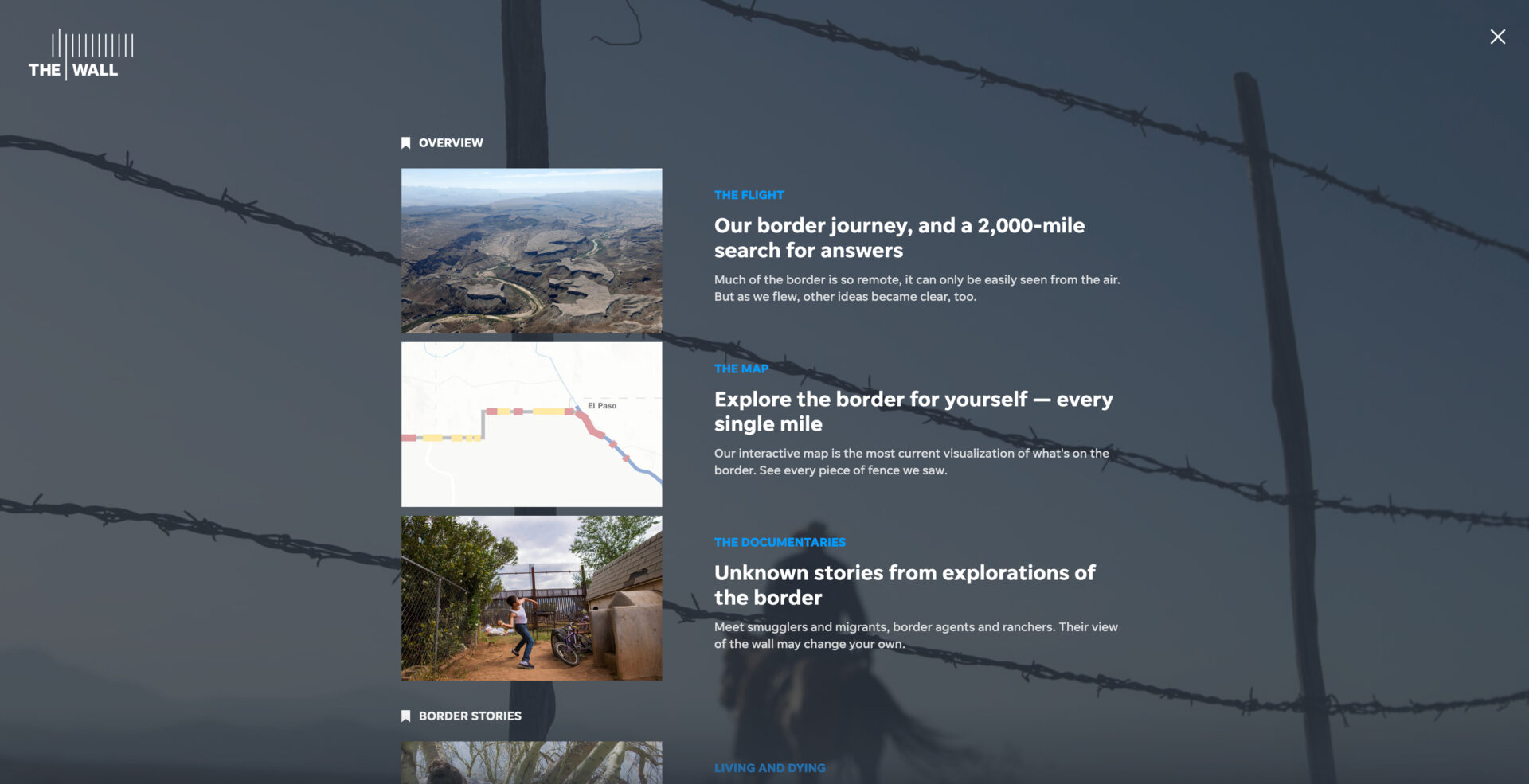
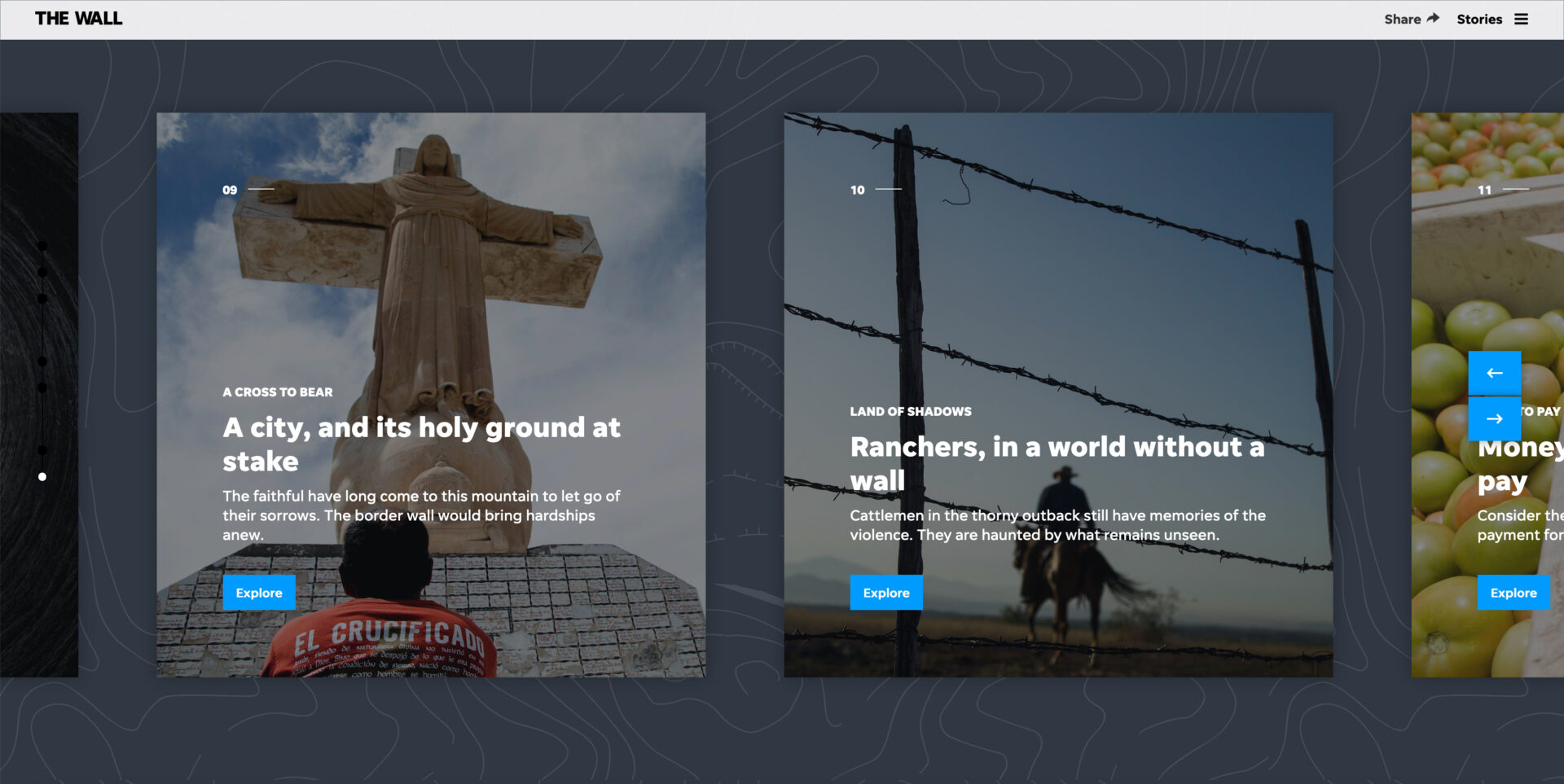
I helped art direct several screens and designed other aspects outright – such as the navigation. We utilized two different navigation methods. We had a hamburger that launched a table of contents, and also had a horizontal nav at the bottom of each article that focused on each day of the series.
Outcome
It was a groundbreaking effort, and paved the way for how Gannett could utilize resources from several different properties to tell a compelling narrative. I’m proud to have been a part of this project.


