Quick view
***
Overview
Our research indicates that while younger users DO want to know what’s going on in the world, they don’t necessarily want to spend a lot of time doing deep dives into longform articles.
Objective
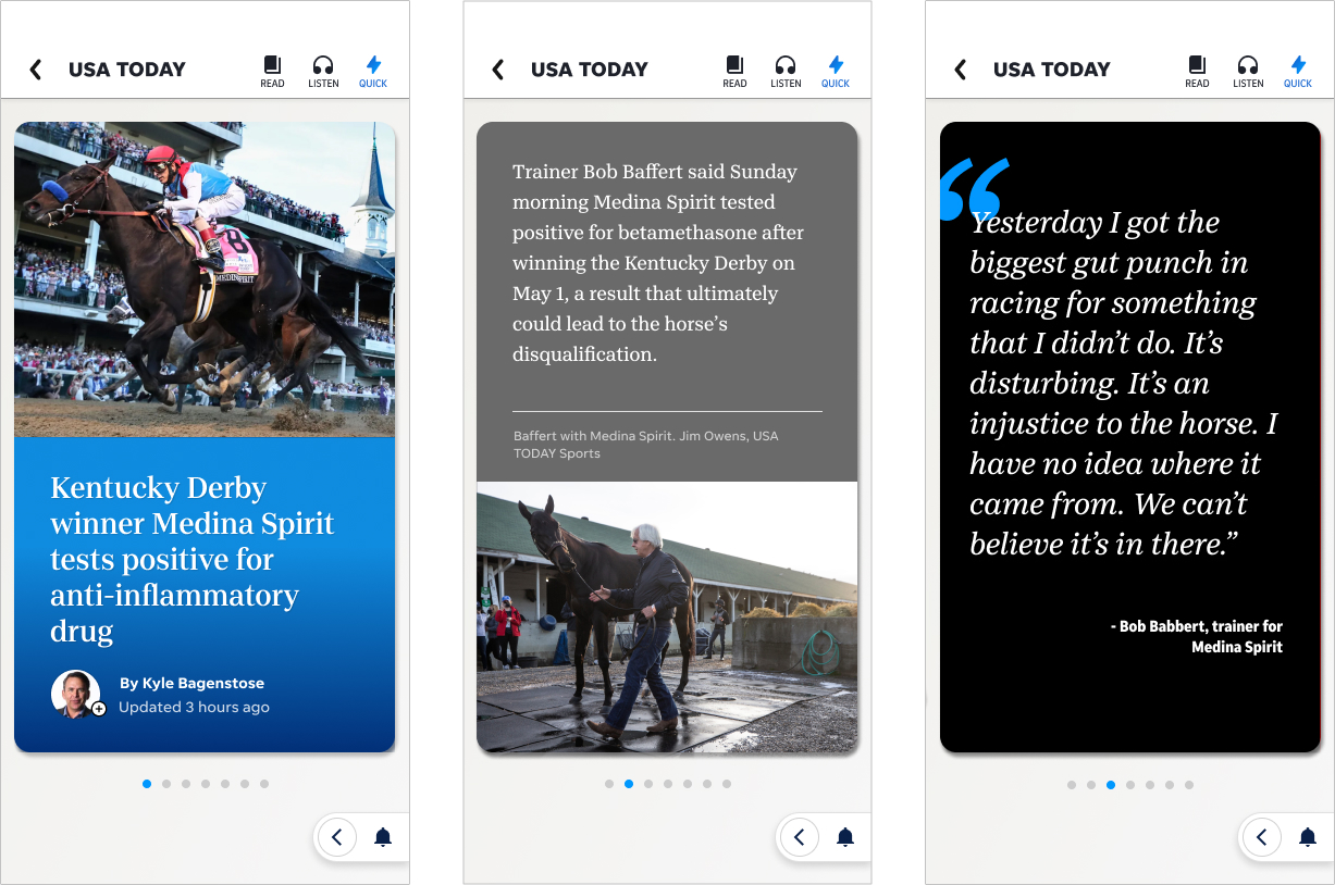
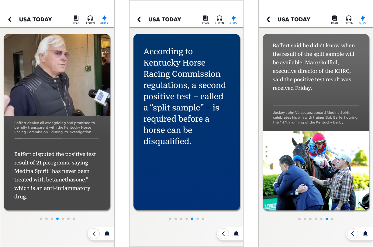
Taking a cue from Snapchat, we wanted to create an optional experience that customers could choose where they could get the gist of the story at a much faster pace. We designed and tested a prototype for a card-based approach that would allow mobile users to swipe through the story one screen at a time.
My role
This project was initially started by another designer, but after he left the company, I picked it up and resumed the designing/testing.
Outcome
We tested this twice, once with a 35-and-under audience and once with a 50+ audience. We found that 100% of the millennial audience really liked the idea and said they would use the feature if it became available.
Things weren’t quite as rosy with the older audience.
While 17% said they would utilize the feature, a third of the older audience had a negative reaction and were quite bothered by the approach, as they felt that important nuances in the content could be lost.
We opted not to pursue it at the time, mostly because it would create extra work for the newsroom. However, with the rise of AI, creating these flexible user-controlled presentation options could become a reality and would no doubt prove valuable in growing a younger audience.


