Kohl’s
***
Overview
Looking to try something different, I took on a role managing a team of nearly two dozen staffers, tasked with producing the offers that are displayed across all of Kohl’s digital media, while also conducting multiple overlapping user tests.
Objective
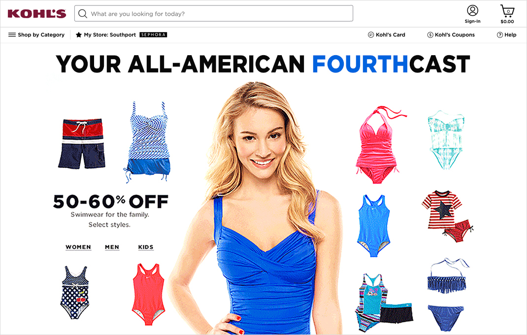
Each month, we designed and built more than a hundred different pages. Every day, the homepage would have a specific design, to highlight whatever the main focus was that day. We also had designs for brand-specific pages, such as Levis, Converse, etc.
Coordinating everything was quite challenging since we had five months of pages in different stages of production at any given time – and the needs of the business often required a lot of pivoting.
For example, one summer we had a plan to push swimsuits early and often, but the season was unusually cold, so we had to pivot and promote other products instead.
My role
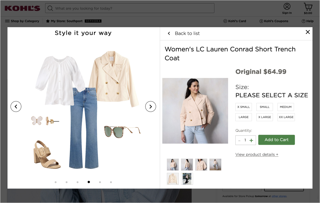
Coordinating production was the majority of my job, but the things that I’m most proud of are the improvements we made to the site/apps, particularly in regard to the navigation and product features.
Kohl’s has a robust A/B testing system, and we typically had at least a half dozen A/B tests running at any given time – evaluation everything from tree-testing the site navigation to A/B testing product feature placement/language.
Outcome
During my time there, we made several changes to the web infrastructure and process, substantially reduced production cost, hired many talented designers and set digital sales records.


