
Article improvements
***
Overview
With the emphasis on acquiring paid subscribers, it was determined that it would be advantageous to create a premium look for signed-in customers. We also wanted to establish a stronger connection with the user.
Objective
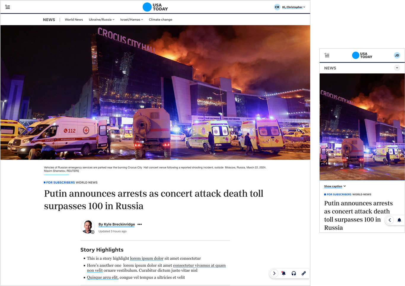
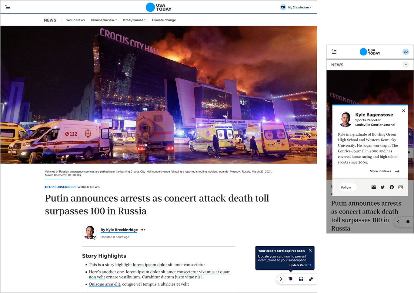
We looked to create the premium experience by decluttering the article through removing the ads and layering in new features. We also felt that promoting our journalists would help the customer feel more of a connection with the product.
We tested prototypes with three main features:
• Larger imagery along with more white space to create a more calming feel.
• A toolbar anchored in the bottom-left corner which contained a lot of the tools (sharing, audio, notifications, etc) that typically clutter up the top of the article.
• An improved byline experience with a reporter photo that linked to a short bio
My role
I worked on the UX designs of these features along with other designers on the team. In addition, I usertested the design using several rounds of unmoderated tests to finetune the designs.
I also finalized documentation for the development team of the author bio and the article toolbar messaging.
Outcome
While the tests showed tremendous user interest, this project was deprioritized for now, so that we could concentrate on other revenue-related projects.